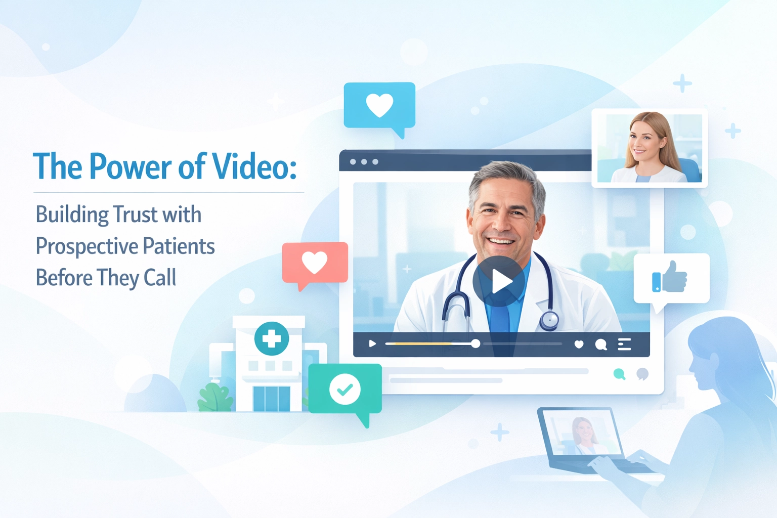
Let's be real: you've invested thousands in PPC campaigns, your facility offers top-notch care, and your staff is incredible. But if your website looks like it was built in 2010 or feels like navigating a maze, you're hemorrhaging money every single day.
Here's the uncomfortable truth: someone seeking treatment for themselves or a loved one makes a judgment about your facility within 3-5 seconds of landing on your site. That split-second impression determines whether they scroll down to learn more or hit the back button and choose your competitor instead.
Your website isn't just a digital brochure. It's your most important salesperson, working 24/7 to convert desperate families into admissions. And right now, if your design isn't dialed in, you're losing qualified leads who were this close to calling.
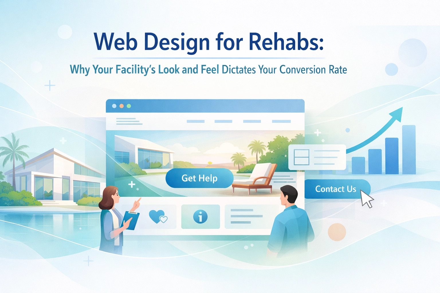
Why Design Quality Directly Impacts Your Bottom Line
Think about the last time you needed to make an important healthcare decision. Did you trust the facility with the outdated website and stock photos, or the one with professional imagery, clear information, and an interface that actually worked on your phone?
Your potential clients are making the same snap judgments.
Research from the Substance Abuse and Mental Health Services Administration (SAMHSA) shows that trust and perceived legitimacy are the primary barriers preventing people from seeking addiction treatment. Your website design either breaks down those barriers or reinforces them.
Poor web design creates friction at every touchpoint:
- Confusing navigation makes visitors give up before finding what they need
- Slow loading times trigger immediate bounces (especially on mobile)
- Unclear calls-to-action leave people unsure what to do next
- Dated aesthetics signal that your facility might be behind the times in other ways too
Meanwhile, strategic design guides visitors smoothly toward conversion: whether that's filling out a contact form, calling your admissions line, or booking a consultation.
The Mobile Experience Makes or Breaks Conversions
Here's a stat that should wake you up: over 60% of people searching for addiction treatment facilities are doing so on their phones. These aren't casual browsers: they're people in crisis, often searching late at night when they've finally admitted they need help.
If your site isn't optimized for mobile, you're turning away more than half of your potential admissions before they even read a word about your programs.
Mobile optimization isn't just about making things smaller. It means:
- Lightning-fast load times (3 seconds or less)
- Touch-friendly buttons and forms
- Readable text without zooming
- Streamlined navigation that makes sense on a small screen
- Click-to-call functionality front and center
One of our clients came to us with a beautiful desktop site that was absolutely brutal on mobile. Their bounce rate on mobile traffic was 78%. After redesigning with mobile-first principles, that dropped to 34%, and their mobile conversions increased by 187%. Same facility, same services: different design.
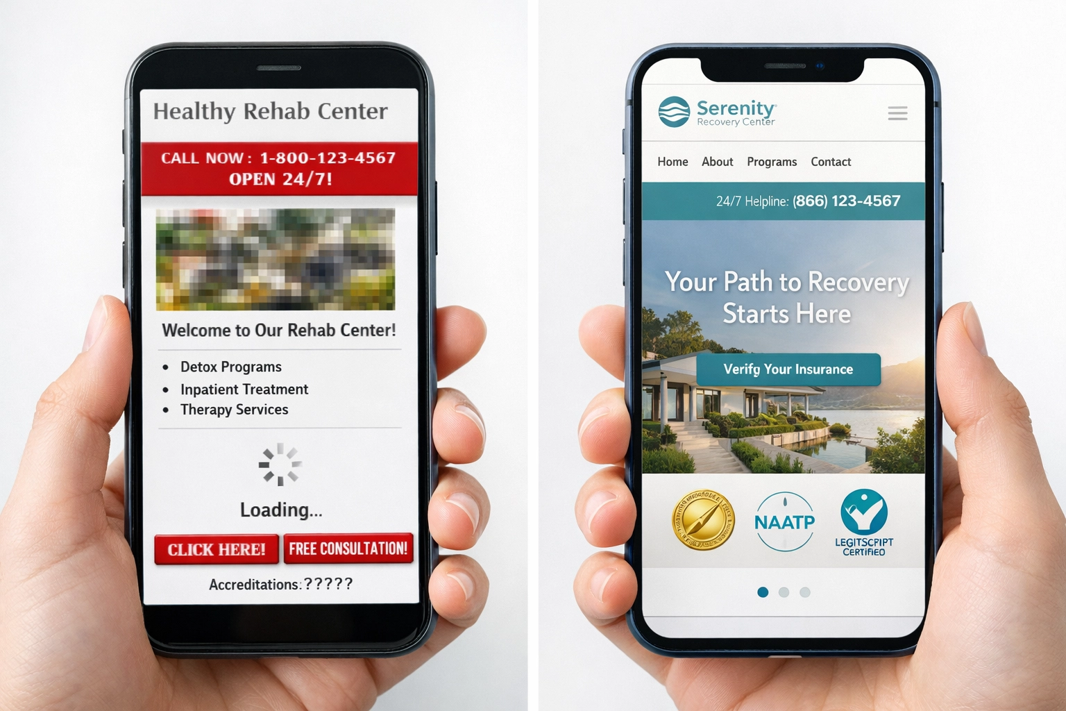
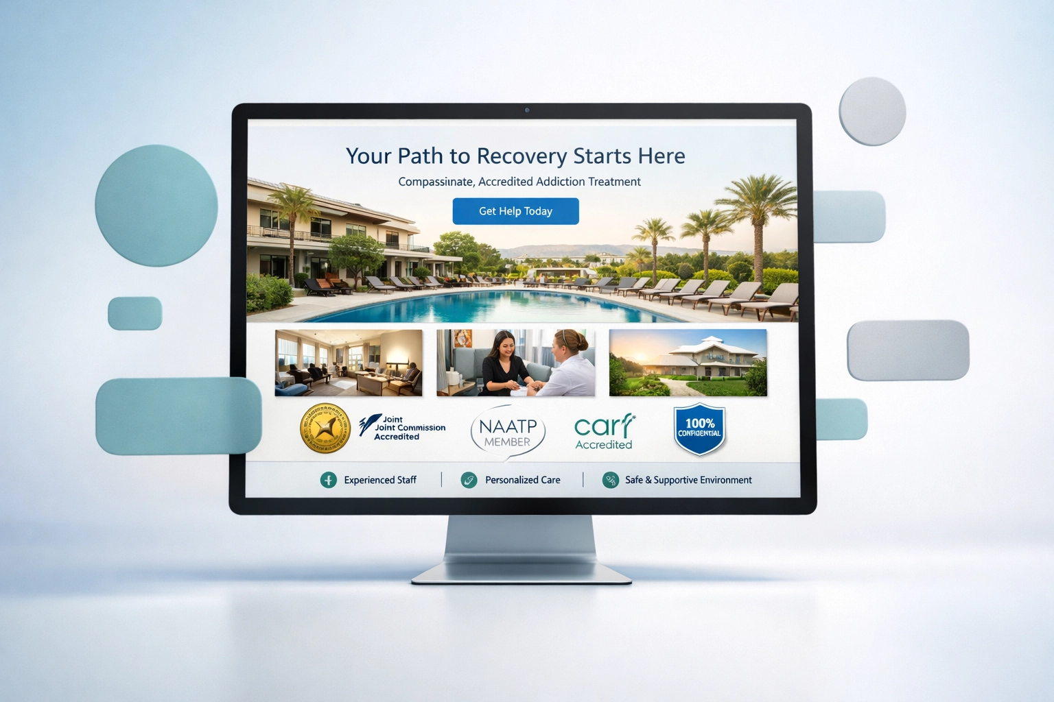
Trust Signals That Convert Skeptical Visitors
Someone researching rehab facilities is scared, overwhelmed, and probably pretty skeptical. They've seen the horror stories. They're wondering if you're legitimate or just another profit-driven center that doesn't actually care.
Your design needs to immediately signal: "We're the real deal."
Key trust elements your site must include:
- Professional photography of your actual facility (not stock images of generic therapy sessions)
- Verified credentials and accreditations displayed prominently
- Clear information about your treatment philosophy and methods
- Real testimonials with names and faces (when permissible)
- Easy-to-find licensing information
- Transparent pricing or insurance details
- Staff profiles with actual credentials
According to the National Association of Addiction Treatment Providers (NAATP), facilities that clearly display their compliance with industry standards and treatment credentials see significantly higher conversion rates than those that don't.
But here's the thing: having this information isn't enough. Your design needs to present it in a way that's scannable and digestible. Nobody's reading walls of text when they're in crisis mode.
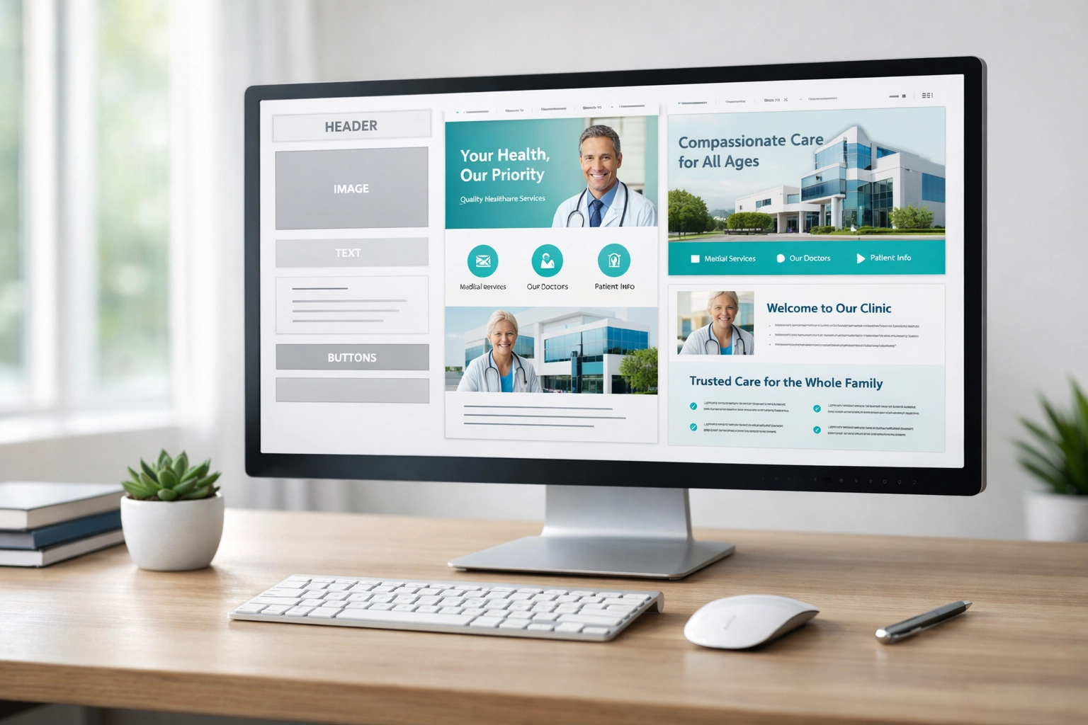
Navigation: The Conversion Killer Nobody Talks About
You know what makes someone leave your site immediately? Not being able to find basic information within 10 seconds.
Think about what someone needs to know when they land on your rehab's website:
- What types of addiction do you treat?
- Where are you located?
- How much does it cost?
- Do you take my insurance?
- What's the daily schedule like?
- Can I tour the facility?
- How do I get started?
If your navigation is buried under vague dropdown menus labeled "Services" and "About," you've already lost them.
Effective navigation for rehab websites includes:
- Clear, specific menu labels (not marketing jargon)
- Prominent contact information on every page
- Multiple conversion points throughout the site
- Search functionality for larger sites
- Breadcrumb trails so people know where they are
- Sticky headers with CTAs that follow as they scroll
Your information architecture should reflect how people actually search for treatment, not how you've organized your internal departments.
The Numbers Don't Lie: Design ROI for Rehab Facilities
Let's talk cold, hard data because as a facility owner, you need to see the return.
Industry benchmarks show massive variation in conversion rates: and design quality is the biggest differentiator:
| Website Quality Level | Average Conversion Rate | Revenue Impact (Annual) |
|---|---|---|
| Poor Design/UX | 1.5% – 3% | Lost revenue: $200K-$500K |
| Average Design | 4% – 7% | Baseline performance |
| Optimized Design | 10% – 15% | Additional revenue: $300K-$800K |
| Top-Tier Design | 15% – 25% | Additional revenue: $1M+ |
Based on industry data from behavioral health marketing studies and SAMHSA treatment statistics
A physiotherapy clinic (similar healthcare conversion environment) redesigned their patient-facing website with conversion optimization in mind. They went from 4.87% conversion to 14.77%: a 203% increase: simply by improving design, trust signals, and conversion pathways.
For a rehab facility averaging 40 admissions per month at $15,000 per patient, improving your conversion rate from 5% to 12% could mean an additional $1.8 million in annual revenue. Same ad spend, same staff, better website.
Speed Matters More Than You Think
Here's something that'll make you check your site right now: for every second your page takes to load, your conversion rate drops by roughly 7%.
Someone searching for addiction treatment isn't patient. They're anxious, maybe physically uncomfortable from withdrawal, and probably questioning whether they should even be doing this. A slow website gives them time to change their mind.
Google's PageSpeed Insights can tell you exactly where you stand. If you're not loading in under 3 seconds on mobile, you're bleeding conversions.
Common speed killers for rehab websites:
- Oversized, unoptimized images
- Too many third-party scripts (chat widgets, tracking pixels)
- Cheap hosting that can't handle traffic spikes
- Bloated page builders and themes
- No content delivery network (CDN)
We've seen facilities spend $50K/month on PPC while ignoring a website that takes 8 seconds to load. That's like having a leaky bucket: you can pour in more water, but you're never solving the actual problem.
The Call-to-Action Problem
Your website can look amazing, load instantly, and build massive trust: but if your calls-to-action are weak or missing, none of it matters.
Every page should have a clear next step. Not subtle. Not clever. Clear.
Effective CTAs for rehab websites:
- "Call Now for Immediate Help: 305-539-7114" (always visible)
- "Verify Your Insurance in 60 Seconds"
- "Take Our Free Assessment"
- "Schedule a Confidential Consultation"
- "Text Us 24/7 for Questions"
These should be visually prominent with contrasting colors, positioned above the fold, and repeated throughout longer pages.
One small change we frequently make for clients: turning their generic "Contact Us" button into "Talk to an Admissions Specialist Now" with the phone number displayed prominently. That single change often increases form submissions by 40-60%.
How Ads Up Marketing Optimizes Rehab Websites for Conversions
Look, we get it: you're experts at treating addiction, not building websites. That's where we come in.
At Ads Up Marketing, we specialize exclusively in addiction treatment marketing. We understand the unique compliance requirements, the sensitivity of the audience, and exactly what converts in this space.
Our web design process for rehab facilities:
- Comprehensive conversion rate analysis of your current site
- Mobile-first responsive design built for speed
- Strategic trust signal placement and messaging
- Conversion-optimized page layouts and CTAs
- HIPAA-compliant form integrations
- LegitScript certification support and compliance
- Ongoing optimization based on real performance data
We've worked with dozens of treatment facilities to transform their websites from digital liabilities into admission-generating machines. And we don't just build it and disappear: we monitor, test, and optimize continuously.
Your website should work as hard as your admissions team. If it's not pulling its weight, we need to talk.
Signs Your Rehab Website Needs a Redesign
Not sure if your site is costing you conversions? Here are the red flags:
- High bounce rate (above 60% means people leave immediately)
- Low time on site (under 2 minutes suggests confusing navigation)
- Poor mobile metrics (if mobile bounce rate is significantly higher than desktop)
- Few form submissions relative to traffic volume
- Your PPC campaigns underperform despite strong keywords and ad copy
- Visitors don't scroll beyond the first screen
- The site looks dated (if you built it more than 3 years ago, it's probably outdated)
The good news? Unlike reputation damage or market saturation, website performance is completely within your control and can be fixed relatively quickly.
Take Action Before Your Competitors Do
Your competitors are reading articles like this too. The facilities that prioritize web design and user experience are capturing the patients you're spending ad dollars to reach.
Every day you wait is another day of lost admissions, wasted marketing spend, and families choosing someone else because your website didn't inspire confidence.
Here's what to do right now:
- Pull your website analytics and check your conversion rate
- Test your site on mobile (honestly assess the experience)
- Run a speed test and see where you stand
- Call 305-539-7114 to talk with our team about a free website audit
At Ads Up Marketing, we've proven that strategic web design isn't an expense: it's one of the highest-ROI investments you can make in your facility's growth. We'll show you exactly where you're losing conversions and how to fix it.
Don't let poor design stand between you and the people who need your help. Contact us today and let's transform your website into the conversion machine it should be.
Your facility deserves a website that matches the quality of care you provide. Let's make that happen.