INSIGHTS
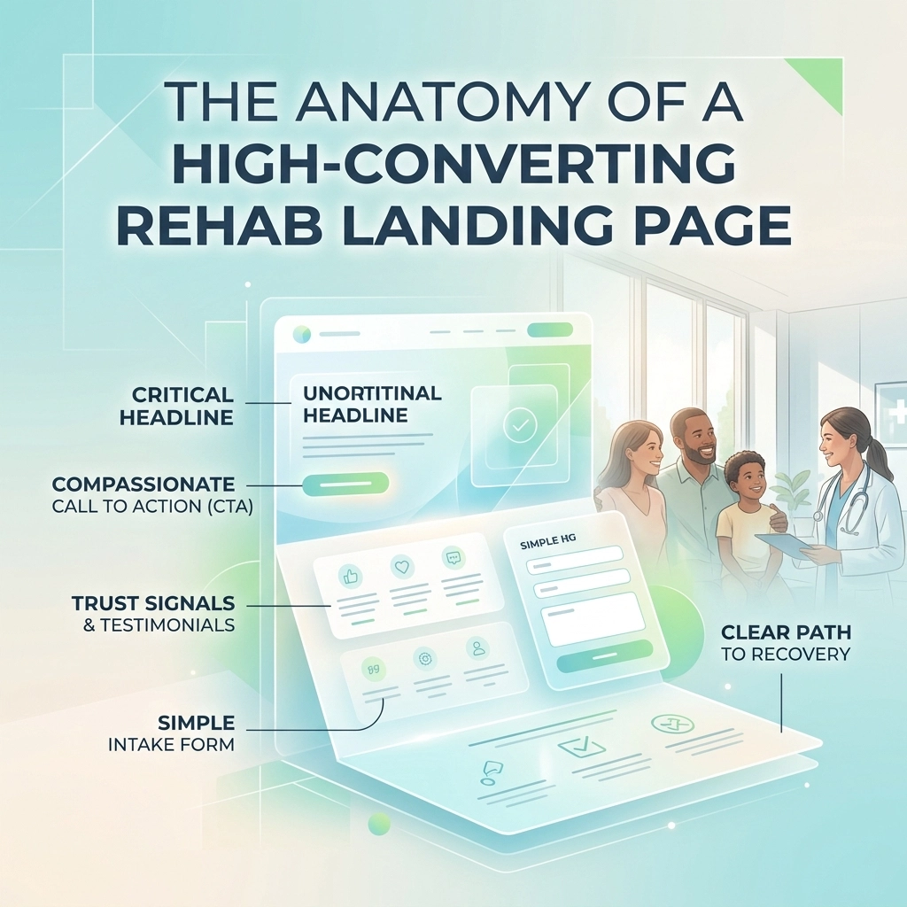
The Anatomy of a High-Converting Rehab Landing Page
You’re spending $20,000, $50,000, or maybe even $100,000 a month on Google Ads. The traffic is flowing, the clicks are high, but your admissions team is sitting around twiddling their thumbs. It’s a gut-punch, isn't it? Watching your marketing budget evaporate into the digital ether without seeing a single person actually walk through your doors for treatment.
In the addiction treatment space, a "pretty" website isn't enough. If your landing page doesn't resonate with the person at their absolute lowest point: or the panicked family member looking for a lifeline: you’ve already lost them. In 2026, the competition for drug rehab leads is fiercer than ever, and the cost-per-click is only going up.
I’m Lee Bushby, and at Ads Up Marketing, we’ve dissected thousands of rehab campaigns. We’ve seen what works and, more importantly, what causes potential patients to bounce in three seconds. Let’s break down the exact anatomy of a landing page that doesn’t just look good, but actually converts.
Table of Contents
- The Hero Section: The Three-Second Reassurance
- UX and Technical Performance: The Silent Conversion Killers
- Performance Impact: Standard vs. High-Converting Pages
- The Psychology of Trust and Social Proof
- Strategic CTAs: Guiding the Desperate to Discovery
- Compliance and Credibility: Beyond the Design
- Data-Driven Optimization: The Final 10%
1. The Hero Section: The Three-Second Reassurance
When someone lands on your page, they are usually in crisis. They are looking for one thing: Hope.
Your hero section (the part visible without scrolling) needs to answer three questions immediately:
- Am I in the right place?
- Do they treat my specific problem?
- Can I trust them?
Your headline shouldn't be "Welcome to Our Rehab." It should be "Start Your Recovery Today in a Safe, Clinical Environment." Use the "Outcome for [Target] without [Objection]" formula. For example: "Comprehensive Detox for Professionals Without Sacrificing Privacy."
Don't use stock photos of people looking miserable in dark rooms. People want to see the "after." Use high-quality, authentic images of your facility and smiling staff. If you’re running Google Ads, your landing page headline must match the ad copy. If the ad promised "Executive Alcohol Detox," the landing page better say "Executive Alcohol Detox" right at the top.

2. UX and Technical Performance: The Silent Conversion Killers
You could have the most life-changing program in the world, but if your page takes five seconds to load on a mobile phone, nobody will ever see it. According to industry standards from sources like SAMHSA, individuals seeking help often experience high levels of stress, which leads to very low patience for technical hurdles.
- Mobile-First is the Only Way: Over 75% of your traffic is coming from a smartphone. If your phone number isn't a "click-to-call" button or if your form is hard to type into, you are burning money.
- Speed is Revenue: Aim for a load time under 2 seconds. Every second beyond that can drop your conversion rate by 20%.
- Navigation-Free Zone: A true landing page should not have a main menu. Don't give them a reason to click away to your "About Us" or "Blog" page. Keep them focused on the goal: calling you at 305-539-7114.
3. Performance Impact: Standard vs. High-Converting Pages
To give you an idea of why this matters for your bottom line, let’s look at the numbers. If you're a rehab owner trying to figure out how much you should actually make, the conversion rate of your landing page is the biggest lever you can pull.
| Feature | Standard "Brochure" Site | High-Converting Landing Page |
|---|---|---|
| Average Conversion Rate | 1% – 3% | 12% – 22% |
| Load Speed | 4.5 Seconds | 1.8 Seconds |
| Primary CTA | "Contact Us" (Small) | "Verify Insurance" (Sticky/Bold) |
| Trust Signals | Hidden in Footer | Above the Fold (LegitScript/CARF) |
| Form Style | 12-Field Long Form | Multi-Step Interactive Form |
| Mobile UX | Responsive (But Clunky) | Thumb-Optimized / Click-to-Call |
| Cost Per Admission | $8,000 – $12,000 | $3,500 – $5,500 |
As you can see, the difference isn't just a few percentage points; it's the difference between a struggling facility and one that is consistently at 90% occupancy.
4. The Psychology of Trust and Social Proof
In healthcare marketing, trust is the currency. Since the person visiting your site is often skeptical or scared, you need to "borrow" credibility. This is where social proof comes in.
But wait: don't just dump a list of 500-word testimonials. Use "Bite-Sized" social proof:
- Video Testimonials: 30 seconds of a former patient saying, "This place saved my life," is worth more than ten pages of text.
- Accreditation Badges: Display LegitScript certification, Joint Commission (JCAHO), or CARF logos prominently. These aren't just decorations; they are symbols of safety.
- Trust Bar: "Over 1,000 Families Helped" or "20+ Years of Combined Clinical Expertise."

5. Strategic CTAs: Guiding the Desperate to Discovery
What do you want the visitor to do? In the rehab world, the phone call is king. While forms are great, a live person on the phone is significantly more likely to result in an admission.
Your Call to Action (CTA) needs to be frequent and varied. We recommend a "Three-Pronged" CTA approach:
- The Direct Ask: "Call Our 24/7 Helpline: 305-539-7114."
- The Low-Friction Ask: "Verify Your Insurance (Takes 60 Seconds)." This is often less intimidating than a phone call. Use conversion tracking to see which one performs better.
- The Sticky CTA: As the user scrolls, a small bar should remain at the top or bottom of the screen with a "Call Now" button.
6. Compliance and Credibility: Beyond the Design
You can't talk about rehab marketing without talking about the legal landscape. Organizations like the National Association of Addiction Treatment Providers (NAATP) have strict ethical guidelines.
Your landing page must be HIPAA compliant. If you are collecting health information through a form, that data needs to be encrypted and secure. Furthermore, your claims must be grounded in science. Avoid "cures" or "guarantees." Instead, focus on "evidence-based treatment modalities."
If you're unsure about your current setup, we offer a free AdWords audit that looks at both your ads and your landing page compliance. It’s better to catch a violation now than to have your Google account suspended later.

7. Data-Driven Optimization: The Final 10%
A high-converting landing page is never "finished." It’s a living document. We use heatmaps to see where people are clicking and where they are getting stuck.
Are they stopping at the pricing section? Maybe you need to lead with insurance information. Are they ignoring your "Our Team" section? Maybe the photos look too much like stock photography.
By constantly tweaking your digital marketing service strategy, you can turn a 10% conversion rate into a 15% rate over six months. That 5% difference could mean five extra admissions a month. What is that worth to your facility?
How We Can Help You Scale
Building a landing page that works is both an art and a science. It requires an understanding of clinical empathy and high-level data analytics. At Ads Up Marketing, we specialize in bridging that gap. We don't just build pages; we build admission engines.
Whether you need help with local SEO to get people to your page or a complete custom solution for your facility's web presence, we have the expertise to make it happen.
Stop letting your marketing budget bleed out through a poorly designed landing page. You’re in the business of saving lives: let us handle the business of getting those lives to your front door.
Ready to see your admissions climb? Give us a call at 305-539-7114 or contact us today to start building a high-converting landing page that actually delivers.