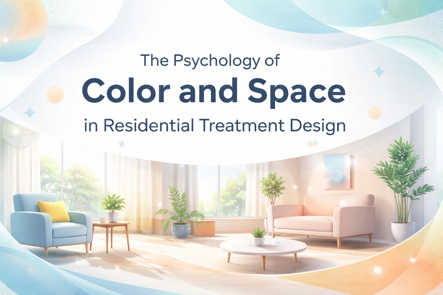
Here's something that might surprise you: the paint color on your facility walls could be affecting your admissions numbers. Wild, right?
When families search for a residential treatment center, they're making one of the most emotionally charged decisions of their lives. And whether they realize it or not, every visual element: from the shade of blue in your lobby to how spacious your common areas feel: shapes their perception of trust, safety, and professionalism.
This is what we call Visual Trust, and it's become a critical (yet often overlooked) factor in treatment center marketing and admissions optimization.
Why Color Psychology Actually Matters in Treatment Settings
Let's get real for a second. You're not running a boutique hotel. You're operating a healthcare facility where people come to heal from addiction and mental health challenges. So why should you care about something as seemingly superficial as color schemes?
Because it's not superficial at all.
Research consistently shows that color and light can support recovery on both physiological and psychological levels. According to studies published in healthcare design journals, strategic color selection directly influences patient outcomes, staff morale, and yes: how families perceive your facility when they're deciding where to send their loved one.
Think about your own experiences. Walk into a space with harsh fluorescent lighting and sterile white walls, and you probably feel… anxious. Clinical. Maybe even a little cold. Now picture a room with warm earth tones, natural light, and thoughtfully placed greenery. Different vibe entirely, isn't it?
Your prospective clients and their families feel this too. Every single time they visit your facility or browse your website photos.
Strategic Color Selection by Treatment Area
Not all spaces in your facility serve the same purpose, so they shouldn't all look the same either. Here's where things get practical.
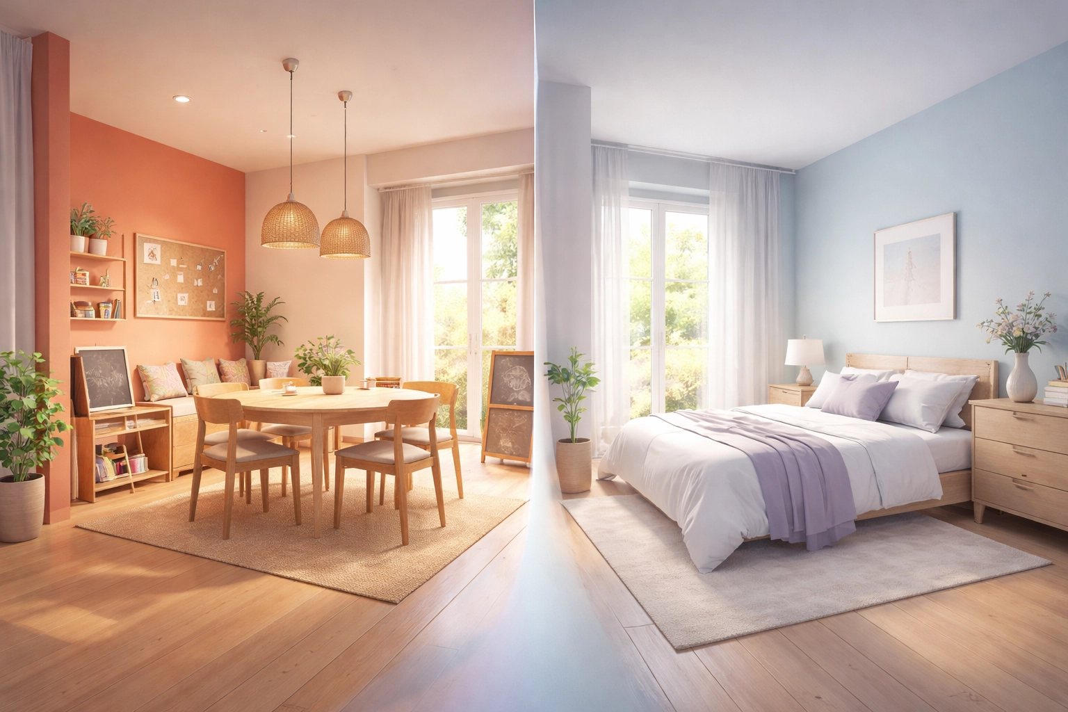
Activity and Social Spaces
Your dining rooms, group therapy areas, and exercise spaces benefit from warm colors like soft oranges, coral tones, and muted yellows. These hues naturally stimulate appetite, encourage social interaction, and boost alertness: exactly what you want during mealtimes and active programming.
A 2020 study examining nursing home residents found that warm colors, particularly yellow, in activity rooms were associated with higher arousal levels measured through heart rate variability. But here's the catch: you've gotta avoid intense reds. They can trigger agitation and even aggression in some individuals. Stick with softer variations like salmon, peach, or terracotta.
Rest and Sleep Areas
Bedrooms and quiet reflection spaces call for the opposite approach. Cool colors like blue and green calm and soothe, making them ideal for areas dedicated to rest and healing. Research published in SAMHSA's treatment improvement protocols consistently emphasizes the importance of creating restful environments for recovery.
That same nursing home study? It found blue rooms produced the lowest arousal levels: perfect for helping residents wind down and actually get restorative sleep.
One word of caution though: avoid very dark blues in mental health settings. They can cause patients to withdraw too deeply into their own thoughts, which isn't helpful during treatment.
Therapy Offices and General Treatment Areas
For spaces where the real therapeutic work happens, green is your friend. It symbolizes growth and renewal, encouraging harmony and balance during difficult conversations. Soft neutrals like warm grays and muted beiges also work well, creating a sense of space and clarity without being cold or institutional.
Light, soothing colors like sage green and dusty blue promote calm and relaxation: the exact emotional state you want someone in when they're working through trauma or addiction issues with a therapist.
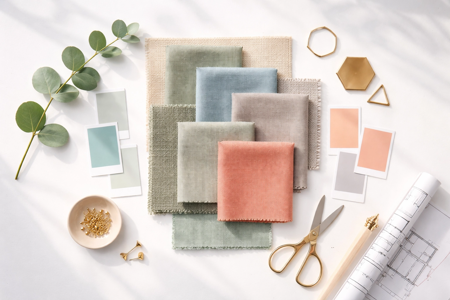
Color Strategy Quick Reference Guide
Here's a breakdown to keep handy when you're planning renovations or marketing photo shoots:
| Treatment Area | Recommended Colors | Colors to Avoid | Psychological Effect |
|---|---|---|---|
| Dining/Activity Rooms | Soft orange, coral, muted yellow | Intense red, bright neon tones | Stimulates appetite, encourages interaction |
| Bedrooms/Rest Areas | Light blue, soft green, lavender | Very dark blues, bright whites | Promotes calm, supports sleep |
| Therapy Offices | Sage green, warm gray, dusty blue | Harsh yellows, clinical white | Encourages openness, emotional safety |
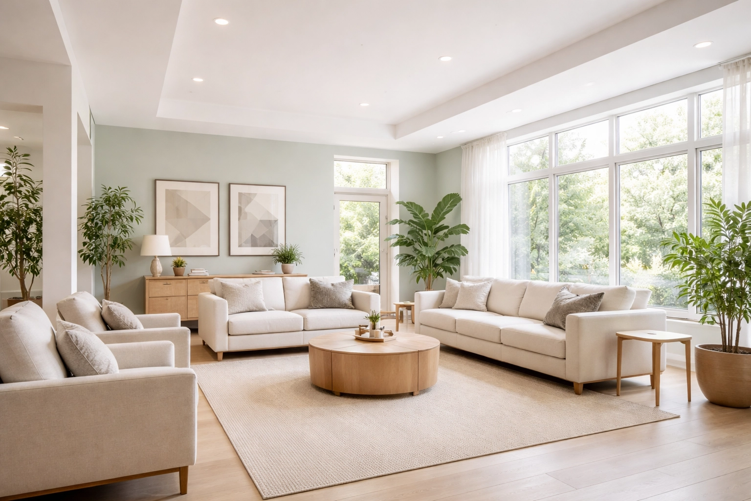
| Common Areas/Lobbies | Earth tones, soft neutrals, light greens | High-contrast patterns, stark whites | Creates warmth, builds trust |
| Behavioral Health Units | Soft, muted tones with minimal contrast | Reds, yellows, glossy finishes | Reduces overstimulation, promotes security |
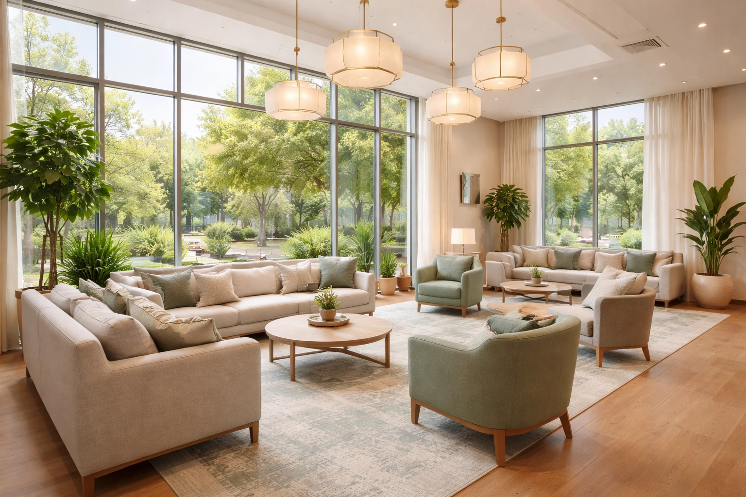
Space Design: It's Not Just About Color
Color's only half the equation. How you use space matters just as much: maybe more.
Cramped, cluttered environments trigger stress responses. Open, well-organized spaces communicate professionalism and care. When families tour your facility (or view photos online), they're unconsciously evaluating whether this place "feels" safe and therapeutic.
A few things to consider:
Natural light is non-negotiable. Whenever possible, maximize windows and reduce dependence on artificial lighting. Natural light regulates circadian rhythms, boosts mood, and simply makes spaces feel more inviting. The National Institute on Drug Abuse (NIDA) emphasizes environmental factors in treatment effectiveness.
Avoid visual clutter. This includes busy patterns, excessive signage, and overcrowded furniture arrangements. In behavioral health settings especially, stick to clean lines and minimal visual noise.
Create flow. Spaces should transition naturally from one area to another. Abrupt changes in color scheme or lighting can feel jarring and unsettling to residents already dealing with emotional dysregulation.
How Visual Trust Impacts Your Admissions Pipeline
So what's the connection between all this design stuff and your actual census numbers?
Everything.
When a family member lands on your website at 2 AM, desperately searching for help, what do they see? Stock photos of generic office buildings? Or authentic images of your thoughtfully designed, welcoming facility?
When they schedule a tour, does your physical space match the professionalism of your clinical program? Or is there a disconnect that plants seeds of doubt?
Visual Trust bridges the gap between your clinical excellence and how potential clients perceive that excellence. You could have the best therapists, the most effective programming, and outstanding outcomes: but if your facility looks dated, institutional, or uninviting, families will hesitate.
And in this industry, hesitation often means they call someone else.
According to NAATP (National Association of Addiction Treatment Providers), facility presentation is increasingly factoring into family decision-making, particularly as treatment options multiply and competition intensifies.
Making Visual Trust Work for Your Marketing
Here's where it all comes together. Your facility's design isn't just about patient experience: it's a marketing asset.
High-quality photography showcasing your thoughtful color choices and inviting spaces should be front and center on your website, social media, and even your admissions process optimization materials.
Virtual tours? Absolutely leverage them. Let families experience your environment before they ever set foot on your property. First impressions happen online now, and you've got maybe 3 seconds to establish credibility.
But capturing all of this effectively: translating your physical space into compelling digital marketing that actually converts: requires expertise in both healthcare marketing and visual storytelling.
Let's Talk About Your Facility's Visual Identity
Look, we get it. You went into this business to help people recover, not to become an interior designer or marketing guru. That's exactly why Ads Up Marketing exists.
We specialize in helping residential treatment facilities showcase what makes them special: including the thoughtful environmental design choices that set you apart from cookie-cutter competitors. From professional photography direction to website optimization that highlights your Visual Trust factors, we've helped facilities across the country turn their physical spaces into admissions-generating assets.
If you're sitting there thinking, "Our facility looks great, but our website doesn't reflect that," or "We're planning renovations and want to make sure we're making smart choices from a marketing perspective," we should chat.
Give us a call at 305-539-7114 or check out our business growth resources to see how we've helped other treatment centers maximize their marketing ROI.
Your clinical program deserves to be represented by a visual identity that matches its quality. Let's make that happen together.