
INSIGHTS
Rehab Website UX Design and Conversion: Designing for Families in Crisis
When a family member sits at their kitchen table at 2 AM, trembling over a glowing smartphone screen to search for addiction treatment, they aren't browsing. They are in a state of acute emotional crisis. They are overwhelmed by fear, guilt, uncertainty, and the crushing weight of a life-or-death decision.
If they land on your treatment center's website during this vulnerable moment, what do they experience? Do they find an overwhelming maze of clinical jargon, slow-loading pages, and hidden phone numbers? Or do they immediately feel a deep sense of calm, absolute safety, and clear, compassionate guidance?
In the specialized world of behavioral health marketing, your digital front door determines whether a family finds the lifeline they desperately need: or bounces back to search engine results in frustration. Mastering rehab website UX design conversion is not merely about ticking off cosmetic design boxes. It is an ethical and operational imperative that directly impacts your census, your facility's viability, and ultimately, lives saved.
Table of Contents
- The 2 AM Reality: Understanding the Mindset of Families in Crisis
- The Core Pillars of Visual Trust in Behavioral Health
- Optimizing the Above-the-Fold Hero Section
- Performance Impact: Standard Design vs. Crisis-Optimized UX
- Streamlining Navigation and Eliminating Cognitive Friction
- Crafting Compassionate Call-to-Actions (CTAs) That Convert
- Mobile Experience: Thumb Reach and Rapid Response
- Partnering with Experts Who Understand Addiction Treatment Marketing
The 2 AM Reality: Understanding the Mindset of Families in Crisis
Imagine the emotional weight resting on the shoulders of a mother or spouse searching for a trusted rehab center. According to data from the Substance Abuse and Mental Health Services Administration (SAMHSA), millions of Americans grapple with substance use disorders, yet only a fraction enter specialized care.
When someone finally reaches the point of seeking professional help, their cognitive bandwidth is severely constricted by stress. They cannot process dense paragraphs of self-congratulatory marketing copy or complicated multi-step contact forms.
"When fear and urgency dictate a user's search behavior, every extra click, confusing menu item, or ambiguous statement increases anxiety and drives them away."
As highlighted by industry standards from the National Association of Addiction Treatment Providers (NAATP), transparency, ethical integrity, and immediate accessibility form the bedrock of successful treatment admissions. If your website fails to convey competence and compassion within the first three seconds, potential clients will navigate away to a competitor who makes the path forward clear.

The Core Pillars of Visual Trust in Behavioral Health
Visual trust is the psychological bridge between a distressed searcher and a confident phone call. In general ecommerce, design is about sleek aesthetics and trendy animations. In behavioral health, design must convey safety, clinical excellence, and absolute discretion.
How do you establish visual trust instantly?
- Calming Color Palettes: Utilize soft blues, muted teals, grounding earth tones, and clean whites. Avoid aggressive reds, jarring neon colors, or chaotic visual clutter that triggers anxiety.
- Authentic Imagery: Ditch generic stock photos of corporate boardrooms or models posing with fake smiles. Showcase your actual facility, your compassionate clinical staff, and tranquil healing environments verified by National Institute on Drug Abuse (NIDA) guidelines.
- Prominent Credentials & Accreditations: Display your CARF, Joint Commission, or state licensing badges clearly in the footer and header areas. Knowing an organization is fully accredited provides instant relief to worried family members.
- Human Faces: Highlighting real therapists, nurses, and medical directors humanizes your brand and signals that real, caring professionals are standing by.
Optimizing the Above-the-Fold Hero Section
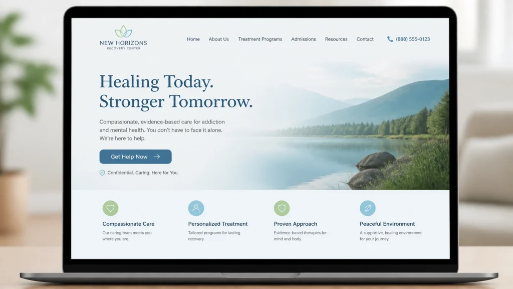
Your website's hero section: the portion visible without scrolling: is prime digital real estate. For behavioral health facilities, it must answer three critical questions in under four seconds:
- What do you do? (e.g., medically supervised detox, residential inpatient, or dual-diagnosis treatment)
- Where are you located? (city, state, or regional setting)
- How do I take the first step right now?
Elements of a High-Converting Hero Section
- Clear, Empathetic Value Proposition: "Compassionate Addiction Treatment and Drug Detox in [City Name]. You don't have to walk this path alone."
- Prominent Emergency Contact Number: Display a tap-to-call phone number right at the top. For immediate assistance, call our admissions team directly at 305-539-7114.
- Primary Conversion Button: A high-contrast button labeled "Get Help Now" or "Speak With an Admissions Counselor" that stands out cleanly against your background.
When paired with a targeted PPC management strategy, a pristine, high-converting hero section ensures that paid traffic translates directly into inbound phone calls.
Performance Impact: Standard Design vs. Crisis-Optimized UX
To understand why intentional UX design matters for your bottom line, let's look at how subtle structural shifts alter user behavior and lead conversion metrics.
| Metric / Feature | Standard Corporate Website Design | Crisis-Optimized Behavioral Health UX |
|---|---|---|
| First-Impression Load Time | 4.2 seconds (High bounce rate) | Under 1.8 seconds (Instant reassurance) |
| Primary Phone Visibility | Buried in footer or contact page | Fixed header & sticky mobile bar (305-539-7114) |
| Form Fields Required | 8–10 fields (Name, Insurance, History, etc.) | 2–3 fields (Name, Phone, Preferred Time) |
| Mobile Accessibility | Clunky desktop scaling, hard-to-tap links | Fully responsive, thumb-friendly touch targets |
| Average Conversion Rate | 1.2% to 2.0% | 4.8% to 7.5%+ |
As this comparison illustrates, removing friction and prioritizing emotional safety directly multiplies your admissions pipeline efficiency. If you are uncertain how your current setup performs, you can request a free website audit to uncover hidden conversion bottlenecks.

Streamlining Navigation and Eliminating Cognitive Friction
When families visit your site, they should never have to guess where to find critical information. A bloated navigation menu with ten drop-down levels causes immediate cognitive overload.
Instead, keep your primary navigation clean, logical, and focused on user intent:
- Programs: Clearly categorized treatment levels (Detox, Residential, Intensive Outpatient, Co-occurring Disorders).
- Admissions: A transparent overview of what to expect, admissions criteria, and what to bring.
- Insurance & Cost: Honest, straightforward guidance on verifying insurance benefits and financial options.
- About Us: Your clinical philosophy, medical team bios, and facility accreditation.
- Contact: Direct phone numbers, secure contact forms, and physical facility directions.
By keeping your information architecture straightforward, you respect the user's emotional state and guide them smoothly toward healing.
Crafting Compassionate Call-to-Actions (CTAs) That Convert
Generic calls to action like "Submit" or "Click Here" feel cold, transactional, and detached. In addiction treatment marketing, your CTAs must sound like an outstretched hand offering support.
Examples of High-Empathy CTAs
- "Verify Your Insurance in 2 Minutes"
- "Speak Confidentially With a Counselor Now"
- "Start Your Recovery Journey Today"
- "Call Our 24/7 Admissions Helpline"
Place these compassionate CTAs strategically at the end of program descriptions, blog articles, and insurance guides. Whenever a user reaches a moment of clarity or decision, give them an immediate, low-friction way to connect.
Need help structuring your digital presence for maximum admissions? Visit our homepage to explore how we specialize exclusively in behavioral health growth.
Mobile Experience: Thumb Reach and Rapid Response
Over 70% of individuals searching for addiction treatment do so on mobile devices: often late at night, in quiet panic, or away from a desktop computer. If your mobile site requires zooming, pinch-gestures, or hunting for a phone number, you are losing families at the exact moment they need you most.

Essential Mobile UX Best Practices
- Sticky Bottom Bar: Implement a fixed bottom bar on mobile screens featuring a pulsing phone icon and a direct tap-to-call button.
- Fast-Loading Infrastructure: Optimize image file sizes and streamline scripts so your site loads instantaneously on cellular data.
- Simplified Forms: Keep mobile contact forms ultra-short. Asking for a name and phone number is enough to initiate a warm, empathetic outreach call from your admissions team.
Partnering with Experts Who Understand Addiction Treatment Marketing
Designing a rehab website that balances clinical empathy, strict compliance standards, and aggressive conversion optimization is a delicate balancing act. It requires deep industry knowledge, data-driven analytics, and an unwavering commitment to ethical marketing practices.
At Ads Up Marketing, we work exclusively with addiction treatment centers and behavioral health facilities. We understand the regulatory nuances, the unique emotional journeys of families in crisis, and the precise digital frameworks required to turn website traffic into meaningful admissions.
You don't have to navigate the complexities of digital marketing alone. Let us help you elevate your web presence, build lasting visual trust, and connect with the families who need your care.
Call us today at 305-539-7114 or reach out through our contact page to schedule your complimentary strategy consultation.