
INSIGHTS
Tour or Gallery? Choosing the Right Visual Format for Your Residential Program
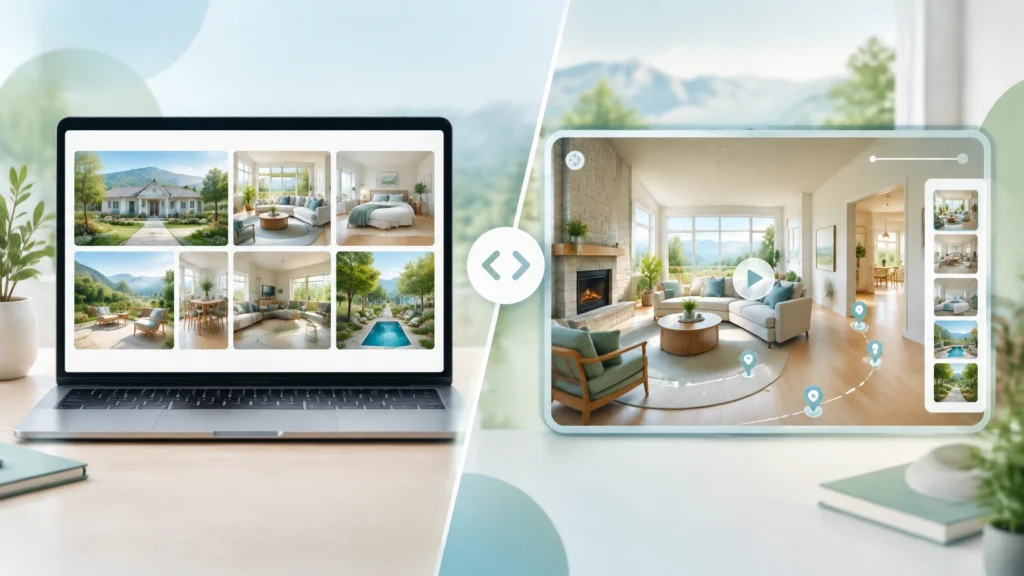
A family member lands on your residential treatment website late at night. They may be scared, exhausted, and trying to make a serious decision quickly.
Before they read your clinical philosophy, they want to know something more basic:
What does this place actually feel like?
Can they picture a bedroom? A therapy room? A safe outdoor space? A welcoming dining area? Can they imagine their loved one arriving there?
That is where visual trust starts, and where the choice between a photo gallery and a guided virtual tour can influence your residential treatment facility business growth.
A gallery helps visitors scan. A guided tour helps them understand.
So which one should your program use?
The answer depends on buyer intent, traffic source, and how much uncertainty the visitor needs to resolve before contacting admissions.
Table of Contents
- Why visual trust matters in residential treatment marketing
- When a photo gallery is the better format
- When a guided virtual tour makes more sense
- Gallery vs. virtual tour: a performance comparison
- A simple A/B test plan for your website
- What to include in either format
- How Ads Up Marketing can help
Why Visual Trust Matters in Residential Treatment Marketing
Choosing residential treatment is not like buying a pair of shoes online. Families are evaluating safety, clinical quality, privacy, culture, location, cost, and whether the program feels appropriate for someone they love.
The website cannot answer every question. But it can reduce the fear of the unknown.
Research from Baymard Institute shows that users often rely on images to understand whether an experience or product feels right for them. Healthcare decisions are different from e-commerce, of course, but the underlying behavior is familiar: when people cannot physically inspect something, visuals become a major source of confidence.
A strong visual experience should help a visitor answer:
- Where will I sleep?
- What will the daily environment look like?
- Is the facility clean, calm, and organized?
- What spaces support treatment?
- Does this program serve people like me or my family member?
- What happens after I look around?
That last question matters. Your visuals should not be a dead end. They should guide the visitor toward a confidential call, inquiry, or admissions conversation.
When a Photo Gallery Is the Better Format
A photo gallery is usually the better first experience for visitors who need to make a quick assessment.
Think about someone arriving from a Google Ad after searching “residential treatment near me.” They may be comparing several programs in a short period. A long video may feel like too much commitment. A clean gallery lets them scan the essentials in seconds.
Use a gallery when visitors are likely to:
- Arrive from paid search or social advertising
- Compare multiple facilities
- Browse on a mobile phone
- Have a clear service or location in mind
- Need reassurance before making a first call
- Have limited time or bandwidth
A gallery can also work well on a PPC landing page because it supports quick decision-making without forcing the visitor to watch a video before seeing important information.
Build a gallery around real questions
Do not organize images only by what looks attractive. Organize them around what families need to know.
Include photos of:
- Bedrooms and bathrooms
- Group therapy and counseling rooms
- Dining and kitchen areas
- Outdoor spaces and common areas
- Admissions or reception areas
- Specialized spaces, such as fitness, art, or meditation rooms
- Accessibility and safety features, when appropriate to show
Use short captions. “Comfortable common area” is less useful than “Shared lounge used for supervised recreation and family visits,” assuming that description is accurate.

The goal is not to make the facility look luxurious. The goal is to make it feel understandable.
Avoid overly staged stock photography and images that imply services or amenities you do not actually offer. In behavioral healthcare, an image that creates the wrong expectation can hurt trust later.
When a Guided Virtual Tour Makes More Sense
A guided virtual tour is more useful when the visitor is further along in the decision process and needs context, not just snapshots.
A parent researching residential care for a teenager may want to understand how spaces connect. An out-of-state family may need a better sense of the campus before traveling. A referral source may want to see whether the environment aligns with a client’s needs.
A guided tour can answer those questions by creating a visual narrative:
“Here is where you arrive. Here is where admissions begins. Here is where therapy happens. Here is where residents spend downtime. Here is how the environment supports structure and privacy.”
That narrative is valuable for high-consideration decisions.
Use a guided tour when visitors are likely to:
- Arrive through organic search or branded searches
- Be comparing programs over several days
- Live outside your immediate service area
- Have already read your program and clinical pages
- Need more reassurance before contacting admissions
- Want to understand the experience before discussing treatment
A tour should not feel like a cinematic commercial. It should feel like a calm, honest orientation.
Keep the primary version concise, often two to five minutes is enough. Add chapters or timestamps so visitors can jump to the areas most relevant to them. Include captions and a transcript for accessibility, and make sure the video works well on mobile.

If you serve distinct populations, consider separate tour paths. A young adult program, women’s residential program, and co-occurring mental health program may have different environments and expectations. Showing the right environment to the right visitor can improve relevance.
Gallery vs. Virtual Tour: A Performance Comparison
Neither format wins in every situation. The better choice depends on the visitor’s intent and the action you want them to take.
| Visitor situation | Best starting format | Why it may work | Primary performance metric |
|---|---|---|---|
| High-intent paid search visitor | Photo gallery | Fast scanning and lower friction | Qualified calls and form submissions |
| Out-of-state family | Guided virtual tour | Builds context and reduces travel uncertainty | Tour engagement and admissions inquiries |
| Mobile visitor comparing programs | Photo gallery | Easier to browse quickly on a small screen | CTA clicks and call volume |
| Organic visitor researching care options | Gallery plus tour | Supports both scanning and deeper evaluation | Assisted conversions |
| Branded or returning visitor | Guided virtual tour | Helps resolve final concerns | Qualified opportunities and admissions |
| Retargeting audience | Tour or short video | Re-engages visitors who already know the program | Return visits and inquiry rate |
This is not about choosing one asset and ignoring the other. In many cases, the strongest website uses a gallery as the quick proof point and a guided tour as the deeper trust experience.
That combination supports different stages of the decision without making every visitor consume the same content.
A Simple A/B Test Plan for Your Website
If you are unsure which format will create better results, do not settle the question in a conference room. Test it.
A practical experiment could compare:
- Version A: A prominent photo gallery near the top of the residential program page
- Version B: A guided virtual tour near the top of the same page
Keep everything else as consistent as possible:
- Same headline
- Same offer
- Same call-to-action
- Same page copy
- Same traffic sources
- Same form and phone placement

Step 1: Write a clear hypothesis
For example:
Visitors from paid search will be more likely to contact admissions after viewing a concise photo gallery, while organic and branded visitors will engage more deeply with a guided virtual tour.
That is specific enough to test.
Step 2: Choose meaningful metrics
Do not make time on page your only success metric. A visitor can spend five minutes watching a tour and still never contact you.
Track:
- Qualified phone calls
- Contact form submissions
- Admissions chats
- Tour starts and completion rates
- Gallery interactions
- Scroll depth
- Cost per qualified opportunity
- Cost per admission, when your tracking systems support it
Ads Up’s conversion tracking services can help connect website actions with calls, opportunities, and admissions instead of stopping at clicks or raw leads.
Step 3: Segment the results
Review results by:
- Paid vs. organic traffic
- Mobile vs. desktop
- Local vs. out-of-state visitors
- New vs. returning visitors
- Program type or population served
A gallery may win overall because most traffic is mobile, while a virtual tour performs better for desktop visitors researching from another state. That distinction is useful. It can lead to a smarter, segmented experience rather than a one-size-fits-all decision.
Step 4: Test long enough to learn something
Avoid declaring a winner after a few days or a handful of clicks. Residential admissions decisions are high consideration, and conversion volume may be uneven.
Let the test run until each version has enough meaningful conversion activity to compare, not just engagement. Then document what changed, what did not, and what you will test next.
What to Include in Either Format
Whether you choose a gallery, tour, or both, the visual experience should follow a few non-negotiable standards.
Show the real environment
Use current images of your actual facility. If a renovation changes the bedrooms, dining area, or outdoor space, update the visuals.
Protect privacy and dignity
Do not show identifiable residents without appropriate, documented consent. Avoid whiteboards, paperwork, computer screens, medication labels, or anything else that could reveal protected health information.
For more guidance on treatment marketing responsibilities, review SAMHSA’s family and treatment resources and NIDA’s treatment information. Your visual content should support an informed decision without making clinical promises.
Make the next step obvious
Place a clear CTA near the gallery or tour:
- “Speak with an admissions counselor”
- “Ask about availability”
- “Request a confidential program review”
- “Call to discuss whether our program is a fit”
If you need help aligning your visuals, page structure, and calls to action, Ads Up’s website design service for addiction treatment centers can help you build around actual visitor behavior, not assumptions.
How Ads Up Marketing Can Help
Visual content is only one part of residential treatment facility business growth. It has to work with your search strategy, landing pages, tracking, admissions process, and capacity.
Ads Up Marketing works exclusively with behavioral health and addiction treatment providers. We can help you determine:
- Whether paid visitors need a gallery-first landing page
- Whether organic visitors need a guided tour and deeper program content
- Which page elements are creating hesitation
- Whether calls and forms are being attributed correctly
- How visual engagement connects to qualified opportunities and admissions
You may not need a bigger marketing budget. You may need a clearer path from “Let me look around” to “I’m ready to ask a question.”
If you want an experienced team to review that path with you, request a confidential marketing analysis or call 305-539-7114.
The right visual format will not replace compassionate admissions support or quality treatment. But it can help the right family feel confident enough to take the next step.