
INSIGHTS
Lighting and Color in Treatment Center Photography: Setting the Right Mood
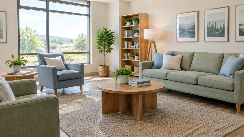
A room can be clean, safe, and thoughtfully run, and still look gloomy or dated in a photograph. If a family is comparing treatment options online, that first impression matters. A dim hallway or yellow-cast lounge may leave viewers wondering whether the facility feels as caring in person as it does on the page.
Good treatment center photography doesn’t make a facility look perfect. It helps people see the real space clearly and feel what it might be like to arrive there.
Table of contents
- What lighting and color communicate
- How to use daylight when you shoot in-house
- Common lighting mistakes, and what to do instead
- Keep your gallery consistent and believable
- Protect privacy while you photograph
- A practical next step
What lighting and color communicate
People don’t evaluate a photo the way a photographer does. They may not notice white balance or dynamic range, but they do notice when a room looks shadowy, harsh, or strangely yellow. Those visual cues can shape their impression of comfort, upkeep, and care, even though a photograph cannot prove the quality of clinical care.
A light, airy image often feels easier to approach than a dark, high-contrast one. Gentle warmth (from wood, natural daylight, or restrained color accents) can make a room feel more human. That doesn’t mean every room needs a cream-and-sage makeover. The goal is to show your actual environment in a way that feels clear, calm, and welcoming.
There’s an important distinction here: warmth is not the same as a yellow color cast. A soft warm tone can make a space feel inviting. But when overhead bulbs turn white walls mustard-colored and shadows muddy, the picture can look dated or poorly maintained. The issue isn’t that your facility uses warm lighting; it’s that the photograph makes the colors seem wrong.
Research and healthcare design guidance support careful attention to visual comfort and daylight, but they don’t establish a single “healing” color palette for every person or facility. The Center for Health Design’s review of color in healthcare environments cautions against treating particular hues as proven clinical interventions. Use color to express your brand and help people understand the space, not to promise an outcome.
How to use daylight when you shoot in-house
You don’t need a studio to get a good facility photo. A window and a little planning can take you a long way.
Try bright, indirect window light
Start with a room that gets steady daylight. Late morning or early afternoon often works well, but the best time depends on which way the windows face and how much direct sun comes in. Overcast daylight can be especially useful: it’s soft and even, with fewer hard-edged shadows.
Turn off nearby lamps if they’re noticeably orange or green compared with the window light. Mixing daylight with different interior bulbs is a common reason one side of a room looks blue while the other looks yellow. If you can’t switch a fixture off because it’s part of the room’s normal use, take a test shot and check whether the mixed colors are distracting.
Use golden hour thoughtfully
Golden hour, the period shortly after sunrise or before sunset, can add a gentle warmth to a space. It can work nicely for a lounge or a common room, especially if direct sun doesn’t create bright patches across the walls or floor.
There’s a trade-off: this light changes quickly and can become very orange. Use it when that warmth fits the room, not because golden hour is automatically more flattering. If the room looks markedly different from how it appears during normal visiting hours, choose a steadier time of day.
Let windows look like windows
A bright window can fool a phone camera into making the room too dark. Tap the screen on the room, not the window, to set exposure, then check that the interior still has visible detail. If the windows become completely white, try another angle or time of day rather than cranking up brightness afterward.
The CIBSE healthcare lighting guide discusses daylight as part of healthcare lighting design. For photography, the practical takeaway is simple: make use of natural light where it represents the space well, while keeping glare and extreme light-dark differences under control.

Common lighting mistakes, and what to do instead
| Common mistake | Why it can hurt the photo | What to do instead |
|---|---|---|
| Shooting with only dim overhead lights | Corners and hallways can look gloomy or institutional | Open blinds and photograph when there’s useful daylight |
| Letting yellow bulbs tint the whole room | Walls and furnishings may look discolored | Turn off conflicting lamps when practical; correct white balance from a neutral reference |
| Pointing a phone flash straight at the room | Creates harsh shadows and bright reflections | Use window light or soft, indirect lighting |
| Photographing directly into a bright window | The window may blow out while the room goes dark | Change position, shoot at a different time, or expose for the room |
| Brightening a dark photo until details disappear | Can make the space look unnatural and washed out | Improve the light at capture; make modest edits only |
| Using a different color treatment in every photo | The gallery feels inconsistent, as if the images show different facilities | Apply a similar, restrained color correction across the set |

Keep your gallery consistent and believable
A facility gallery works best when the photos feel like they belong together. If one image is cool and blue, the next orange, and the next almost white, viewers may wonder whether the spaces, or the photos, match.
Before the shoot, make a short list of locations: reception, a common area, dining space, and any other rooms you want people to understand. Photograph them in similar light where possible. On a phone, avoid switching filters between shots. With a camera, use a consistent white balance rather than letting automatic settings shift from room to room. Adobe’s white-balance overview explains how color temperature affects the appearance of a photograph.
A neutral gray card is helpful if you have one, but there’s no need to buy elaborate equipment for a basic in-house shoot. At minimum, compare photos side by side on the same screen. Do the walls look like the same color? Does the wood look natural? Are some rooms mysteriously much brighter than others?
Keep edits light. Crop and straighten, correct an obvious color cast, and make a small exposure adjustment if needed. Don’t use heavy filters, artificial blur, or aggressive brightness edits to disguise the room. If a space is genuinely dim, showing it honestly, and improving the lighting itself where feasible, is more credible than making the image glow unnaturally.

For more practical planning tips, see our guides to photographing treatment spaces without a studio, building a facility photography shot list, and what your front-entrance photo says about your facility.
Protect privacy while you photograph
Before anyone takes a picture, check the room for details that shouldn’t appear online: names on whiteboards, schedules, paperwork, computer screens, medication labels, and personal belongings. Make sure the space is clear of patients and visitors unless your privacy and compliance teams have approved the specific photo and obtained the required consent.
This matters especially for addiction treatment facilities. Under 42 CFR Part 2, a photograph is included in the definition of patient-identifying information. HHS media-access guidance also addresses the risk of exposing protected health information during photography or filming. Blurring a person afterward is not a substitute for preventing an unauthorized disclosure in the first place. When in doubt, photograph people-free spaces and ask your privacy officer to review the plan.
A practical next step
Good photos won’t fix a confusing website or replace a genuine tour. But clear, consistent images can help families understand your space before they call. If you’re reviewing the bigger picture, Ads Up Marketing can help you connect facility visuals with website design and behavioral health SEO, so your website presents your facility clearly and reaches the people looking for care.
If you’re not sure whether your current gallery feels warm, credible, and true to the experience you provide, take a fresh look at it alongside someone who hasn’t seen it before. And if you’d like a hand improving how your facility shows up online, contact Ads Up Marketing or call 305-539-7114. We’ll help you find a practical way forward.